Monday, December 19, 2011

jan 17-20

Your grade_update Jan 17:

Timesheets
For now, we are no longer keeping timesheets. We may continue Timesheets later. Instead of Timesheets, I will give you a daily employability skills grade based on what you do in class.

Here is a link to how that grade is determined.

ACT words
We will still do ACT words at the beginning of class, but there are changes.
If you are in the Art, Design and Communications (ADC) academy, you will submit your ACT word assignment through Edmodo, using your laptop. All ADC academy students must submit this assignment on line, using Edmodo. If you are in the ADC academy and you do not submit through Edmodo, your grade will be a zero.

If you are not in the ADC academy, you may submit this assignment on paper. You are encouraged to submit the assignment online as well. You could work with someone who has a laptop, or you could use another computer to submit the ACT words assignment through Edmodo.


Electronic devices
Cell phones, portable music players, headphones, earbuds, and other electronic devices are not permitted. This is a school rule.

If I see one of those items, I will ask you to give it to me.

If you give it to me, I will give it back to you at the end of class.

If you choose not to give it to me, or contiunue to break this rule, I will write a referral.

The only exception is your school-issued laptop & ear buds, I believe. That means if you are using your school-issued laptop and ear buds for assigned work, this is permitted....at this point in time. This could change if my understanding is incorrect.


Today:

Take Safety Exam if you have not

Complete Safety Performance Exam if you have not

Join Edmodo and submit ACT words.
5B
ypluew

6B
7haz6j

Make new sketchbooks. 9 pages. Work in sketchbooks.


Complete the Graphic Design Career worksheet

Begin the resume and cover letter assignment

safety in this class

Safety in this class

1. Do not throw anything at any time. Even a sheet of paper or an eraser can cause an injury.

2. Use extreme caution when using X-acto knives, paper cutters, mat cutters, scissors, the tape dispenser, or any sharp instruments. Always cut away from your body, especially your hands.

When using X-acto knives for cutting at a drawing table, a piece of mat board, railroad board, or other similar substance should be placed between the item you are cutting and your wooden desktop.

Never take any tools or equipment outside the classroom. Many of these items may be considered weapons and could result in a zero-tolerance offense.

3. Never possess any item that can produce a flame. Never strike a match, lighter, or any other item that can produce a flame. Some materials such as rubber cement, are flammable and can cause fire.

4. When using spray products such as fixative, spray mount, etc., be sure that you do so in proper ventilation.
Inhaling the fumes of spray fixative, rubber cement, or rubber cement thinner could be toxic and hazardous to one's health and lead to respiratory problems.

5. Follow proper safety precautions when working around electrical equipment, outlets, cords, etc. Never make contact with an electrical device when any of your hands or any other body parts are wet.

6. Do not have any food, liquids, soft drinks, milk, etc., near a computer.

7. Do not run, push, shove, or engage in "horseplay" in the classroom.

8. Be sure that your seat is stable and that all its legs are in contact with the floor. Do not lean back in your seat.

9. Know the location of the fire extinguisher. In case of fire, leave the room calmly, turn right and exit the building. Assemble in the parking lot for attendance check.

10. Report any damaged equipment, broken equipment, accidents or any potential hazard to the classroom teacher immediately.

11. OSHA stand for the Occupational Safety and Health Administration

12. Accidents or injuries occurring in the classroom should be reported to the instructor immediately.

Accidents require that an accident report be filed. Even a small scratch may seem minor but could become serious if left untreated.

Wednesday, December 14, 2011

grades

You should make very effort to finish work when it is due. Late work, if it is accepted, will receive 75 % of what the grade would have been if the assignment was turned in on time.

Daily and weekly work such as Time sheets and ACT words are due each week. If the ay are not completed on time, the grade will be a zero and cannot be made up. If you are absent, you are still responsible for turning in the work when you return to school.

Thursday, November 24, 2011

dec 5-9

Work in your sketchbooks. This is due on December 9. To be considered for a 100, you should have at least 9 pages (front and back) filled with sketches. This grade counts 10 times. One, large, simple sketch on a page does not count as a page "filled with sketches".

Here is a link to how your sketchbook will be graded:

Sketchbook ideas are also posted here.

Both you and I will grade your sketchbook.


Sign up for Edmodo


B5 code is ypluew

B6 code is 7haz6j

There is a midterm practice exam here.

Study for your midterm. See the review below or I can give you a hard copy.

midterm exam Photoshop review

Create a new Photoshop document:
open photoshop
go to window>workspace>essentials
go to file>new>name: type your name_2015 midterm exam  review (2 points)
width: 14 inches (not pixels) (1 points)
height: 11 inches (1 points)
resolution: 100 (1 points)
color mode: rgb
background contents: white
click OK

Be sure you check Auto-Select Layer

Add 2 vertical and 2 horizontal guidelines to the document to make a grid. (3 points)
You should have guidelines that divide the document into 9 rectangles.

Use the Rectangular Marquee Tool to select one of the rectangles.
Use the paint bucket tool to color this rectangle blue. (3 points)
Type your first and last name, using the color white, in this blue rectangle. (3 points)
Add drop shadow to  your name. (3 points)

Use the Rectangular Marquee Tool to select another rectangle.
Use the paint bucket tool to color this rectangle green. (3 points)
Type “2015 Midterm”, using the color white, in this green  rectangle. (3 points)
Add bevel and emboss to “2015 Midterm”. (3 points)

Use the Rectangular Marquee Tool to select another rectangle.
Use the paint bucket tool to color this rectangle yellow. (2 points)
Use the Custom Shape Tool and draw a custom shape that shows pattern in this rectangle. (2 points)
Type the word pattern in this rectangle. (2 points)

Use the Rectangular Marquee Tool to select another rectangle.
Use the paint bucket tool to color this rectangle light purple. (2 points)
Use the Custom Shape Tool and draw a custom shape that shows emphasis in this rectangle. (2 points)
Type the word emphasis in this rectangle. (2 points)


In the remaining rectangles, place 5 photos. (10 points) 
Scale these photos, in proportion, up or down, until they are a little larger than the rectangles they will fit into. (5 points)
Use the Rectangular Marquee Tool + Select>Inverse to cut out parts of the photos the that are larger than the rectangles. (5 points)
Remember that you may need to go to Layer>Rasterize>Layer or Smart Object.
Do not rasterize All Layers.

Save this document as a JPEG and email it to me at topperselfie@gmail.com. (3 points)
In the subject line, type your first and last name, 2015 Midterm exam review, and your block number. (3 points)

Monday, November 14, 2011

nov 16

Timesheets & ACT words

Sketchbooks (counts 10 times). 9 full pages, front and back.

Begin Song Lyric assignment.

Sunday, November 6, 2011

nov 8 & 10

SSA

I will not be writing hall passes for a while, so please do not ask.

ACT words & Timesheets due today.

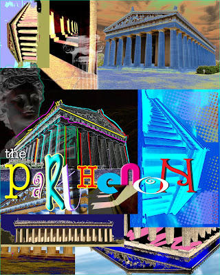
Finish Parthenon poster. Due today.

Assignment objectives and your grade:
Clone Tool used correctly (20 points)
At least 5 different layer images and filter effects (40 points)
The words The Parthenon is part of the design (10 points)
Creativity and visual appeal (20 points)
Strong center of interest (10 points)

Work in sketchbooks

Homework for the next assignment: Song lyrics from a song that you like. All lyrics must be appropriate.

Tuesday, October 25, 2011

Tuesday, October 18, 2011

october 28

Your grade: This nine week grading period, what you earn is what you get.

Make new sketchbooks. Keep sketchbooks in a separate bin, not in your folders.

Turn in timesheets today.

Starting next week, new ACT word sheets. Two words per week. Be sure to put down dates. No ACT words until next week.

Today's assignment_The Parthenon Project_filters
This is not your final artwork
12 different layers with 12 different filters
Use all four photos that you downloaded
16x20
300 resolution

Due today


Monday, October 17, 2011

the parthenon project


The objectives of this assignment are:
1. Use the Clone Tool to remove unwanted areas in a photograph.

2. Use filters to alter the look of a photograph

3. Create a poster that is visually appealing and that has a strong center of interest.
The poster should have at least 10 different different image layers with a different filter and effect on each one. The poster also should have the words "The Parthenon" on it.

4. Use typography creatively


Steps

Download the photos you will use and save them in a folder on your computer.
Go here to download your photos for the project:

Open Parthenon1 in Photoshop and save it as Parthenon1_working.
Use the Clone Tool to get rid of the person by the steps. Be sure to save your work as a PSD file.

Open Parthenon2 in Photoshop and save it as Parthenon2_working.
Use the Clone Tool to get rid of the people. Be sure to save your work as a PSD file.

Open Parthenon3 and 4 in Photoshop and save them as Parthenon3 and 4_working.

Be sure to keep your original downloads in your folder. Do not do anything to them. Save them as copies if you are going to alter them.

Experiment with Filters.

When you have decided on 10 different image and filter effects, place them in a 16 x 20 inch Photoshop document that has a resolution of 300.

Type the words The Parthenon on your layout. Be creative. Use layer styles, warp type, etc.

Creatively and visual appeal will be part of your grade.

Your grade:
Clone Tool used correctly (20 points)
5 different layer images and filter effects (40 points)
The words The Parthenon is part of the design (10 points)
Creativity and visual appeal (20 points)
Strong center of interest (10 points)

Saturday, October 8, 2011

October 10 & 12

No ACT words or timesheets this week.

Sketchbook due October 12. It counts 10 times a normal grade. Look at the grading rubric.
You should have 5-10 "full" pages for an "A".

assignment objectives:
1. Sketchbook should show some sketches that study and analyze typography and design principles.
2. Sketchbook should show some sketches that could be developed into a design concept that would communicate an idea to others.
3. Should meet the requirements of the rubric at http://hillwoodpics.blogspot.com/


Missing assignments are zero unless you were absent on October 6.

Wednesday, October 5, 2011

October 4 & 6

Sketchbook due next week. It counts 10 times a normal grade. Look at the grading rubric.
You should have 5-10 "full" pages for an "A".

SkillsUSA_a field trip is in your future.

Missing assignments are zero after today.

Complete the Type and Custom Shapes + Layer Styles assignment. See assignments. This goes on the next grading period.

Tuesday, October 4, 2011

wordle

Take a look

Monday, September 26, 2011

september 26, 28 & 30

Several of you are failing or are in danger of failing this class.
You can complete the Typing Tool review and the Custom Shape Tool review if you do it today, September 26. If not, it will remain a zero.

You may not make up grades for timesheets or ACT words.

Your sketchbook grade:
I will grade your sketchbook once each 9 week grading period. It is a major grade.
If you are not working on assignments, you should be working on your sketchbook.
You will turn in your sketchbooks for a grade on October 12 and 13.
Work in your sketchbook if you are not working on your logo.

Today:
Create a logo for the Hillwood News.

Steps:
Go online and sketch (in your sketchbook) 3 logos from a major news media site. This could be ABC, CBS, NBC, Fox, etc. You could also get some ideas from NFL.com. Sketches due in 20 minutes. We did this last week.

Create the logo for the Hillwood newscast. Sketch first, then create in Photoshop.
Due September 30.

standards & objectives:
STANDARD 2.0: Students will analyze and apply typography to the design of a visual image.
STANDARD 3.0: Students will analyze and demonstrate design principles and processes.

assessment:

The logo design:
1. Has immediate impact. An effective logo "grabs" attention.

2. Appealing to the eye.
3. Creates or evokes a positive image.
4. Accurately represents the organization or business.
5. Is memorable.

Each category is worth 20 points

Saturday, September 24, 2011

hillwood news logo design

Assignment:
Create a logo for the Hillwood News.

Steps:
Go online and sketch (in your sketchbook) 3 logos from a major news media site. This could be ABC, CBS, NBC, Fox, etc. You could also get some ideas from NFL.com. Sketches due in 20 minutes.

Create the logo for the Hillwood newscast. Sketch first, then create in Photoshop.
Due September 30.

standards & objectives:
STANDARD 2.0: Students will analyze and apply typography to the design of a visual image.
STANDARD 3.0: Students will analyze and demonstrate design principles and processes.

assessment:

The logo design:
1. Has immediate impact. An effective logo "grabs" attention.

2. Appealing to the eye.
3. Creates or evokes a positive image.
4. Accurately represents the organization or business.
5. Is memorable.

Each category is worth 20 points

Wednesday, September 21, 2011

september 22

Check Gradespeed

Food and beverages may disappear...if.....

ACT words.

Turn in folders and timesheets today.
9/12
9/14
9/16
9/20
9/22

SkillsUSA membership. $15.00.

Your sketchbook grade:
I will grade your sketchbook once each 9 week grading period. It is a major grade.
If you are not working on assignments, you should be working on your sketchbook.
You will turn in your sketchbooks for a grade on October 12 and 13.

Today:
Create a logo for the Hillwood News.

Steps:
Go online and sketch (in your sketchbook) 3 logos from a major news media site. This could be ABC, CBS, NBC, Fox, etc. You could also get some ideas from NFL.com. Sketches due in 20 minutes.

Create the logo for the Hillwood newscast. Sketch first, then create in Photoshop.
Due next week.

standards & objectives:
STANDARD 2.0: Students will analyze and apply typography to the design of a visual image.
STANDARD 3.0: Students will analyze and demonstrate design principles and processes.

assessment:

The logo design:
1. Has immediate impact. An effective logo "grabs" attention.

2. Appealing to the eye.
3. Creates or evokes a positive image.
4. Accurately represents the organization or business.
5. Is memorable.

Each category is worth 20 points


Finish:

Typing Tool assignment.

Custom Shapes review assignment.

Work in sketchbooks if you are not working on assignments.
Concentrate on variety of line, pattern and emphasis. How do you create emphasis?

Go to hillwoodpics for sketchbook ideas.

Ongoing subject and assignments: Photoshop review

Description of activity: Use of photoshop tools correctly

Assignment objectives:
Use custom shape tool correctly
Use typing tool correctly
Create a poster using the typing tool for your name and the custom shape tool

standards & objectives:
STANDARD 2.0: Students will analyze and apply typography to the design of a visual image.
STANDARD 3.0: Students will analyze and demonstrate design principles and processes.

assignments
complete custom shapes review

complete typing tool review

Monday, September 19, 2011

Digital Design assignment: name in photoshop


Digital Design_Name in Photoshop

What I want you to know:
1. To learn to use the type tool
2. To learn to use the move tool
3. To learn to resize type
4. To learn how to apply layer styles
5. To add color to a background

Directions:
1. open photoshop
2. go to window>workspace>default workspace or Essentials
3. go to file>new>name: type your name_my name in photoshop
width: 10 inches (not pixels)
height:10 inches
resolution: 100
color mode: rgb color
background contents: white
click OK
4. click on T in the tools palette
5. click once inside the document window
6. type your name
7. click on the check mark on the top menu

NOTE: Look in the top Options Bar, right below the word “Photoshop”.
Be sure that Auto Select Layer is checked.

8. resize: go to edit>transform>scale and resize your name
click the check mark when you have what you want or the cancel button if it’s not what you want.
9. go to file>save as
10. save into your folder
11. repeat and create 5 layers with your name (use a different typeface, color, and size on each layer)

Be sure one layer stands out from all the rest, creating a center of interest.


1. save the document into your folder as a PSD. Do not flatten.
2. go back to individual layers and apply the following effects using Layer>Layer Styles:
Drop Shadow
Bevel and Emboss
Warp Type
Pattern Overlay
Stroke
3. make the background a color that makes the letters come forward.

Remember that you can turn off the eyeballs on Photoshop layers to simplify what you are doing to each layer.

Assessment rubric:
1. Document size and resolution is correct. (10 points)
2. Document is named and saved correctly. (10 points)
3. Name is on 5 separate layers. (10 points)
4. Name is created in 5 different typefaces. (10 points)
5. Name is created using 5 different colors. (10 points)
6. All layer styles are applied (20 points)
7. Background color is used (10 points)
8. One layer stands out from all the rest. (20 points)

Wednesday, September 7, 2011

CTE Online_Adobe PhotoShop CS

Go to this link.

Look at Digital Photography Model, on the left.

Click the plus (+) sign to the left of Adobe PhotoShop CS.

Watch and review the tutorials, except for the Pen Tool.

Tuesday, September 6, 2011

ACT words


Sunday, September 4, 2011

How your grade is determined


Digital Arts & Design 1
Photography

Grading Plan rev. dec 10_17

How your grade is determined

Nine-week grades are determined by the following categories and percentages:
Homework 10%
Formative grades 0%
Summative grades 90%

Daily classwork: Many assignments are graded on satisfactory completion of the daily assignment. Daily classwork assignments are due on the day they are assigned. A zero will be recorded if the daily assignment is not done. Daily assignments may only be made up for excused absences.

Projects: Assignments for projects usually contain criteria and problem solving content encompassing the entire range of cognitive abilities. The student will exhibit knowledge, comprehension, application, analysis, synthesis, and evaluation in almost all assignments completed for a grade. Evaluation is determined by the proper execution of criteria contained in each assignment (Were all the specifications & conditions accurately met? Are minimum standards and competencies exhibited? Is the work professionally prepared and presented? etc.). Projects usually take more than one class period and count more than daily assignments.

I utilize rubrics, score sheets and checklists to determine the numeric grade for most projects.

Past due work: Work may be made up for excused absences. Makeup work will be given a due date, based on the number of absences and type of assignment. Makeup work not completed by the due date will be recorded as a zero.


Student Signature:___________________________________________Date:_________________


Parent/Guardian Signature:___________________________________________Date:_________________


Homework: The purpose of homework is to help reinforce what was taught in class. Sometimes its purpose is to gather extra information beyond what was taught in class
Formative assessment: The goal of formative assessment is to monitor student learning to provide ongoing feedback that can be used by instructors to improve their teaching and by students to improve their learning. Formative assessments are generally low stakes, which means that they have low or no point value.
Summative assessment: The goal of summative assessment is to evaluate student learning at the end of an instructional unit by comparing it against some standard or benchmark. Summative assessments are often high stakes, which means that they have a high point value.


Thursday, September 1, 2011

art vocabulary_elements & principles


The Art Elements
The major groupings are:
Line, shape and mass, light-value-color, texture, space, and time & motion

I. Line: A line is a path left by a moving point. A continuous mark on a surface.

What are the functions of line?
1. to outline a shape
2. to create movement and emphasis
3. to develop pattern and texture
4. to shade and model using hatching, crosshatching and stippling.

What are types of lines?
1. actual line - is a visible mark made by a pencil or paint or any other medium.
2. implied (or psychic) line - is where there is no real line yet we feel a line.
a. eyes looking in a direction
b. a hand pointing in a direction
3. lines formed by edges - the edge of a solid object reads as a line.

What are the characteristics of line/direction and quality?
1. line direction
a. horizontal lines seem placid
b. vertical lines give stability and upward thrust.
c. diagonal lines imply action
2. line quality influences the overall emotional impact of the art work - they can be thick, thin, straight, curved or angular - these are the emotional qualities of the line itself.

II. Shape and Mass
Shape is a two dimensional area with identifiable boundaries.
Mass is a three-dimensional solid with identifiable boundaries.
Volume may be synonymous with mass except that volume can also refer to a void as in an empty enclosed space.

What are the two broad categories of both shape and mass?
1. Geometric shapes - mechanically drawn lines, squares, rectangles, circles. We see them in architecture and manufactured items.
2. Organic shapes - are shapes based on forms of nature, which are usually rounded, irregular and curving. Leaf, seashells, flowers. We see them in nature and with characteristics that are free flowing, informal and irregular.

III. Light, Value and Color
1. Light - artists use natural light in architecture and sculpture to create shadow patterns over the course of the day to create dramatic effects. Painters use these same shadow patterns to also create a dramatic focal point in their paintings as seen in Thomas Eakin's "The Concert Singer".
2. Value - is the lightness or darkness of a color
Categories of Values
Tint is adding white to color paint to create lighter values such as light blue or pink.
Shade is adding black to paint to create dark values such as dark blue or dark red.
High-Key is where the picture is all light values.
Low-Key is where the picture is all dark values.
Value Contrast is where light values are placed next to dark values to create contrast or strong differences.
Value Scale is a scale that shows the gradual change in value from its lightest value, white to its darkest value black.

3. Color - is a function of light

Color affects us both psychologically and physiologically in our response to it.

What responses do you get from color?
a. cool colors recede in space.
b. warm colors come forward in space.
c. cool colors are calm.
d. warm colors evoke active emotions.

1. Color Theory
a. light travels in a straight line
b. refracted light produces different colors.
1. white light goes into a prism
2. the spectrum of light waves are bent into the different colors.
c. What we perceive as a color is reflected light.
example - if light strikes a blue surface, that surface absorbs all the light except the blue spectrum and reflects the blue back to the eye.
d. What are the properties of the color wheel?

1. Primary colors
a. Red
b. Yellow
c. Blue

2. Secondary Colors
a. Orange
b. Green
c. Violet

3. Tertiary Colors
a. Red-violet
b. Red-orange
c. Yellow-orange
d. Yellow-green
e. Blue-green
f. Blue-violet

4. Complementary Colors
Those directly opposite to one another on the color wheel - those colors complement or work well together.


Color Properties are hue, value and intensity
1. Hue is the name of the color
a. red
b. yellow
c. blue

2. Value is the lightness or darkness of the normal color.

3. Intensity is the purity of the color, you can only lower intensity, to do so you add black, gray, or the complimentary color.

1. Color Harmonies - or color scheme is the use of two or more colors in a single composition.
What are the types of color harmonies?

1. Monochromatic - all the same hues or colors, though the value and intensity can be different

2. Complementary Harmonies - hues of directly opposite values on the color wheel are used, i.e.: Red and Green.

3. Analogous Harmonies - color adjacent to one another on the color wheel are used, red and red-orange.

4. Triadic Harmonies - the use of three colors equidistant on the color wheel.


Optical Effects of Color
1. Simultaneous Contrast - if you place two complementary colors next to each other both of them will seem more brilliant, i.e.: red seems redder and green seems greener.

2. After Image - a particular phenomenon of complementary colors where after staring at a color for a minute or so, the glancing away at a white piece of paper the same image will appear in the complementary as a ghost image, i.e.: the American flag.

3. Pointillism - optical color mixture - is when patches or dots of color are placed together, the eye will blend them to produce a new color, i.e.: Georges Seurat's study of El Chahut.

4. Emotional Qualities - color effects emotions and conveys symbolism
A. green-envy.
B. blue-sadness.
C. red-anger.
D. yellow-cowardice.
E. warm colors are active and happy - red, orange.
F. cool colors are passive - blue and green.

IV. Texture refers to surface quality.
What are the two types of texture - Actual and Visual.
1. Actual refers to tactile or sense of touch
a. Impasto technique of thick point, i.e.: Van Gogh's Starry Night.
2. Visual texture - refers to an illusion of texture.

Real Texture is the actual texture of an object. Artist may create real texture in art to give it visual interest or evoke a feeling. A piece of pottery may have a rough texture so that it will look like it came from nature or a smooth texture to make it look like it is machine made.
Implied Texture is the where a two-dimensional piece of art is made to look like a certain texture but in fact is just a smooth piece of paper. Like a drawing of a tree trunk may look rough but in fact it is just a smooth piece of paper.

V. The two types of space are three dimensional and two dimensional.
1. three dimensional space - is the actual space an object takes up, our body, a house, a can or a sculpture. An example is the Frank Lloyd Wright, Guggenheim Museum.
2. two dimensional space - refers to the space in a painting, drawing, print or other type of flat art.

Positive Space-In a drawing or painting positive shapes are the solid forms
in a design such as a bowl of fruit. In a sculpture it is the solid form of the
sculpture.

Negative Space-In a drawing it is the space around the positive shape or
the shape around the bowl of fruit. In sculpture it is the empty shape
around and between the sculptures.

What are the six elements used in two dimensional space?
1. spatial organization.
2. illusion of depth.
3. linear perspective.
4. isometric perspective.
5. atmospheric perspective.
6. foreshortening.

VI. Spatial Organization - refers to how we place forms in the picture to keep unity and balance in the composition, i.e.: Degas' Dancers at the Barre.

Illusion of Depth - the illusion of three dimensional space in the picture plane - the two ways are overlapping and positioning.
a. Overlapping is to place one figure over the other and stacking them in space, i.e.: Marie Laurencin's Group of Artists.
b. Position - is that pictorial figures meant to be further away are placed higher in the composition, i.e.: the closet in the foreground and the farthest higher in the composition.
c. Linear Perspective - the most realistic, a science of vision created in the 15th century in Italy.
d. forms that are far away from the viewer seem smaller.
e. parallel lines recede into the distance and converge or meet at a vanishing point, i.e.: DA Vinci's Last Supper.
1. one point perspective
2. two point perspective
d. Isometric Perspective - Where distant forms are made smaller and placed higher on the picture plane and parallel line stay parallel, i.e.: Kumano Mandala's Japan "ideal city".
e. Atmospheric Perspective - this means that forms meant to be farther away in the distance are blurred, become indistinct and misty.
f. Foreshortening - that proportions are either shortened or lengthened to create an unusual angle of vision to increase the illusion of depth, ie: Mantega's Death of Christ.

VII. Time and Motion
Two dimensional art freezes time

Three dimensional art, demands that you can walk around it and see 360' of different imagery -


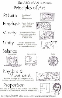
Principles of Design


Balance: a principle of design that refers to the equalization of elements in a work of art. There are three types of balance
Asymmetrical-balance in which one side of the composition appears different from the other side while remaining balanced with it.
Symmetrical- balance in which both sides are identical.
Radial-balance based on a circle, with features radiating from a central point.

Contrast: a principle of design that refers to differences in values, colors, textures, and other elements in artwork to achieve emphasis and interest.
Emphasis: a principle of design by which the artist or designer may use opposing sizes or shapes, contrasting colors, or other means to place greater attention on certain areas or objects in a work of art. Emphasis is achieved by dominance and subordination, bright against dull, light on dark, large among small, etc.
Movement: a principle of design that refers to the arrangement of parts in artwork to create a flow of the viewer’s eye through the repeated arrangement of line, shape, color, texture or value; through the orderly positioning of objects; through contrasting positive and negative shapes; through contrasting sizes; or through gradation of colors and values.
Pattern: a principle of design in which combinations of lines, colors, and shapes are repeated. These repetitions create rhythm in a work of art. Motif is a unit that is repeated in visual rhythm (suggest movement through repetition). Units in a motif may or may not be an exact duplicate of the first unit.
Unity: a principle of design that refers to a sense of wholeness or oneness in an artwork. In other words, all the parts look like they belong together. Unity involves the co-ordination of all these parts to communicate the idea of the artwork.

No one element in a design is an entity in itself. Each element is positioned and organized to contribute to the harmony and unity of the total design.

Unity requires varying emphases so that the design has dominant and subordinate parts.

Unity may be achieved by repetition of color, texture, value, shape, and/or line; by similarity-the colors, shapes or textures all resemble each other; and by grouping or overlapping visual elements.